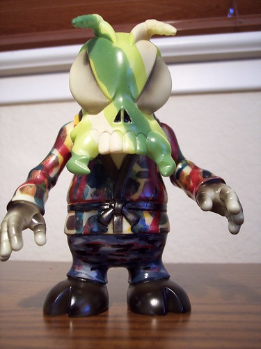
Here's a bee I worked on... tried to be different ("experimental") and even i still don't know how i feel about it, so comments are welcome.

| skullbrain.org http://skullbrain.org/legacy/ |
|
| Camo Bee http://skullbrain.org/legacy/viewtopic.php?f=19&t=10883 |
Page 1 of 2 |
| Author: | rhinomilk [ Thu May 24, 2007 10:23 am ] |
| Post subject: | Camo Bee |
Here's a bee I worked on... tried to be different ("experimental") and even i still don't know how i feel about it, so comments are welcome.
|
|
| Author: | BloodDrinker6969 [ Thu May 24, 2007 10:26 am ] |
| Post subject: | |
The head part is great, but the body seems a little busy. Still cool though. |
|
| Author: | justinvancouver [ Thu May 24, 2007 10:32 am ] |
| Post subject: | |
Your Bee is great. It's nice to see some new styles.. |
|
| Author: | chris [ Thu May 24, 2007 10:33 am ] |
| Post subject: | |
Strip it and start agiain. Seriously. |
|
| Author: | rhinomilk [ Thu May 24, 2007 10:37 am ] |
| Post subject: | |
chris wrote: Strip it and start agiain. Seriously. yeah, i will probably do that... there's things that i like about it, but probably doesn't go well when i mash it all together, so trying to get some feedback. |
|
| Author: | toybotstudios [ Thu May 24, 2007 10:41 am ] |
| Post subject: | |
camo is cool. my only suggestion is to re-do the body in camo colors, but maybe keep the pattern (sans the dripping blood) I would love to see a camo Bee. the head is cool. maybe a bit less linear pattern on the face. i'm thinking Ahnold in "predator" look here... |
|
| Author: | tavaro [ Thu May 24, 2007 10:48 am ] |
| Post subject: | |
I like the honeycomb pattern, maybe experiment more w/ that. |
|
| Author: | MANIMAL [ Thu May 24, 2007 12:30 pm ] |
| Post subject: | |
the head is very well done - continue that look onto the body |
|
| Author: | Dean [ Thu May 24, 2007 1:03 pm ] |
| Post subject: | |
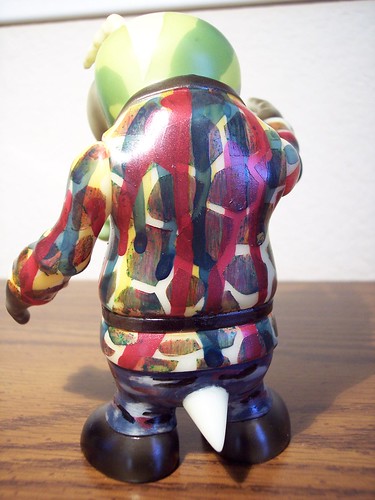
I agree that the bee would succeed better if the pattern on the head were extended to the rest of the body. I like that you kept the lining and belt of the gi black instead of making the whole thing patterned. Good thinking. One thing I like about the head is that you didn't try to cramp a whole bunch of camo elements onto it. Using big areas of color is really working here ... and it actually does look like camo. I also tend to agree that the blood drippings on the body are maybe one element too many. That would probably look better on a more simple or solid color scheme. Anyway, please don't take these constructive criticisms harshly. This is a really admirable effort and you've got some great ideas! |
|
| Author: | living dead [ Thu May 24, 2007 1:20 pm ] |
| Post subject: | |
I really like the Camo Head, but would have to agree about stripping the body. It looks like a smoker jacket gone really wrong. I do like the head though. I like that you tried something new, but it's too solid and too busy at the same time on the jacket if I'm making any sense? |
|
| Author: | Arin C. [ Thu May 24, 2007 1:27 pm ] |
| Post subject: | |
The eyes and hands are cool too, but yeah, the jacket is pretty distracting |
|
| Author: | rhinomilk [ Thu May 24, 2007 1:38 pm ] |
| Post subject: | |
living dead wrote: I really like the Camo Head, but would have to agree about stripping the body. It looks like a smoker jacket gone really wrong. I do like the head though. I like that you tried something new, but it's too solid and too busy at the same time on the jacket if I'm making any sense? no. nobody asked for your opinion |
|
| Author: | DYBBUKIM [ Thu May 24, 2007 2:03 pm ] |
| Post subject: | |
Jeff, that bee is fantastic. You tried to mix themes, and it works. It does look unusual in that few figures can do this and pull it off. Don't listen to those who don't like it -- great paints will always have those who hate them. Thanks for sharing. |
|
| Author: | LamourSupreme [ Thu May 24, 2007 3:16 pm ] |
| Post subject: | |
i dont know. am i the only one that likes that jacket? looks great to me. i say it's a keeper. |
|
| Author: | siphilon [ Thu May 24, 2007 4:23 pm ] |
| Post subject: | |
LamourSupreme wrote: i dont know. am i the only one that likes that jacket? looks great to me. i say it's a keeper. yes I like the body, the head needs to be changed! but then again the painting on the head looks really good, especially from the profile view, I'd say go with that theme throughout. |
|
| Author: | SHAPESHIFTA [ Thu May 24, 2007 4:24 pm ] |
| Post subject: | |
I like the head and the jacket, however I think there is too much contrast between them. I think the pattern on the jacket is great, but I think it would have flowed better if you had used the same color combo as the head ,or vise versa. SHAPE |
|
| Author: | devilboy [ Thu May 24, 2007 5:00 pm ] |
| Post subject: | |
xoconostle wrote: I agree that the bee would succeed better if the pattern on the head were extended to the rest of the body. I like that you kept the lining and belt of the gi black instead of making the whole thing patterned. Good thinking. One thing I like about the head is that you didn't try to cramp a whole bunch of camo elements onto it. Using big areas of color is really working here ... and it actually does look like camo. I also tend to agree that the blood drippings on the body are maybe one element too many. That would probably look better on a more simple or solid color scheme. Anyway, please don't take these constructive criticisms harshly. This is a really admirable effort and you've got some great ideas! i agree with this. the head looks great and should be continued. |
|
| Author: | lurker [ Thu May 24, 2007 6:12 pm ] |
| Post subject: | |
"Yikes" |
|
| Author: | rhinomilk [ Thu May 24, 2007 6:42 pm ] |
| Post subject: | |
thanks for the feedback. i will probably redo the whole bee simply because it is for another boardmember and I can't send them something i'm not satisfied with... but this thing took me so long to do i figured i might as well get something out of it (feedback). i'm actually pleased with the jacket because i think if it were on black vinyl (instead of glow) it would have looked pimp, but on this it looks ugly |
|
| Author: | Pogue [ Thu May 24, 2007 6:42 pm ] |
| Post subject: | |
lurker wrote: "Yikes" that is my line! |
|
| Author: | khanate [ Thu May 24, 2007 6:45 pm ] |
| Post subject: | |
Pop that head off! It looks amazing, I wouldn't change it a bit...just alter the body... Actually there are a lot of cool techniques in the body as well, if you used each technique on a different figure they would look great! |
|
| Author: | Stone [ Thu May 24, 2007 8:01 pm ] |
| Post subject: | |
Mmmmm,I love tha head but tha body is just a bit busy for me... |
|
| Author: | lurker [ Fri May 25, 2007 11:53 am ] |
| Post subject: | |
Pogue wrote: lurker wrote: "Yikes" that is my line! that is why i put the quotes cause i imagined you were going to say it! |
|
| Author: | abelincolnjr [ Fri May 25, 2007 7:30 pm ] |
| Post subject: | |
I actually quite like the jacket, it reminds me of some crazy ass modern pop art steez (which is good). Overall i think its striking, keep doin that thing. Its nice to see some customs that break from the norm. |
|
| Author: | rhinomilk [ Mon Jul 16, 2007 7:50 pm ] |
| Post subject: | |
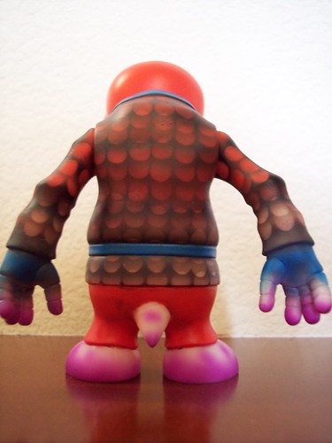
after 2 months this bee is revised (i'm slow). looks like a paul kaiju and lash custom had an ugly baby. peace. 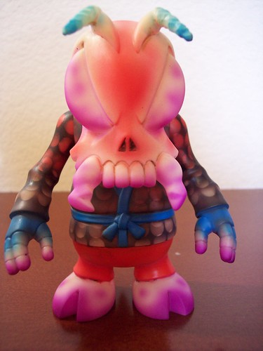
|
|
| Page 1 of 2 | All times are UTC - 8 hours [ DST ] |
| Powered by phpBB © 2000, 2002, 2005, 2007 phpBB Group http://www.phpbb.com/ |
|