Dont pull any punches let me know what you guys really think...
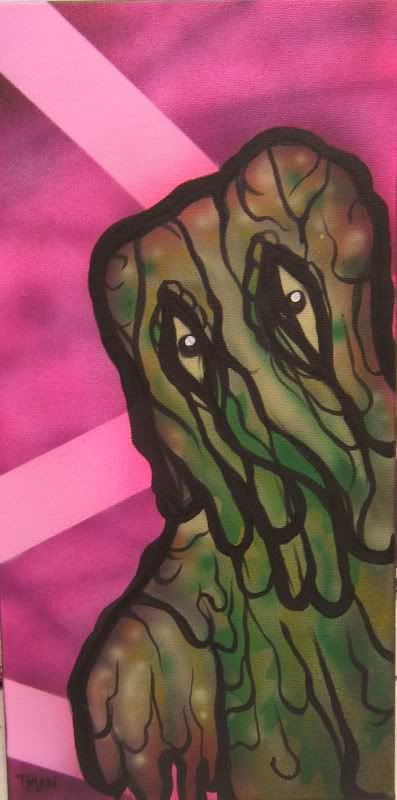
Hedorah 10x20 on stretched canvas.
| skullbrain.org http://skullbrain.org/legacy/ |
|
| Hedorah painting...tear it up fuckers!! http://skullbrain.org/legacy/viewtopic.php?f=5&t=3428 |
Page 1 of 1 |
| Author: | Tman [ Thu Jun 29, 2006 12:41 am ] |
| Post subject: | Hedorah painting...tear it up fuckers!! |
Dont pull any punches let me know what you guys really think...
Hedorah 10x20 on stretched canvas. |
|
| Author: | peppsee [ Thu Jun 29, 2006 9:47 am ] |
| Post subject: | |
oddly soothing for some reason... I really like it. great job |
|
| Author: | Tman [ Thu Jun 29, 2006 12:51 pm ] |
| Post subject: | |
83 veiws and 1 reply....it must be worse than I thought if its not even worth a bashing LOL |
|
| Author: | keiboba [ Thu Jun 29, 2006 1:18 pm ] |
| Post subject: | |
he's thick and sludgy. I like it. |
|
| Author: | LamourSupreme [ Thu Jun 29, 2006 1:24 pm ] |
| Post subject: | |
Tman wrote: 83 veiws and 1 reply....it must be worse than I thought if its not even worth a bashing LOL it's not that bad. not that good either. my suggestions are as follows: 1. color choices are nice. You have to make that green pop out more either with highlights or some other bright colors so it's not so muddy. I like the airbrush effect but go over the actual green with maybe some fluorescent green and orange. Use an opaque white first and then spray fluoresence. 2. the background needs more oomph. nice color and I like the lines. maybe more lines? 3. The eyes really need to pop more. maybe more detail with high contrast and a little shading. |
|
| Author: | Bird or Prey [ Thu Jun 29, 2006 2:21 pm ] |
| Post subject: | |
neat...i want to hug him! BRD |
|
| Author: | straightoutta..LOKASH [ Thu Jun 29, 2006 5:38 pm ] |
| Post subject: | |
I like the pose, and I like the way it looks like search lights in the background.More pop in the colors would be nice though. |
|
| Author: | Tman [ Fri Jun 30, 2006 1:25 am ] |
| Post subject: | |
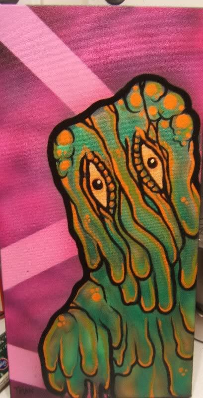
better? |
|
| Author: | ungawa222 [ Fri Jun 30, 2006 4:57 am ] |
| Post subject: | |
About 5x better, T-man- very nice, now! |
|
| Author: | augustwest [ Fri Jun 30, 2006 5:54 am ] |
| Post subject: | |
That is much better...the orange really sets him off. Great way to put the constructive criticism to work!! |
|
| Author: | turtletooth [ Fri Jun 30, 2006 6:19 am ] |
| Post subject: | |
Very cool! I really like the orange highlights in the second version, nice contrast. |
|
| Author: | plover [ Fri Jun 30, 2006 6:49 am ] |
| Post subject: | |
augustwest wrote: That is much better...the orange really sets him off. Great way to put the constructive criticism to work!! +1 |
|
| Author: | Paulkaiju [ Fri Jun 30, 2006 7:26 am ] |
| Post subject: | |
Good work! I like the improvement you did! |
|
| Author: | jltohru [ Fri Jun 30, 2006 8:11 am ] |
| Post subject: | |
hey tman, is that on a canvas? |
|
| Author: | lurker [ Fri Jun 30, 2006 8:54 am ] |
| Post subject: | |
hmm i saw this same painting on ebay... |
|
| Author: | Tman [ Fri Jun 30, 2006 11:01 am ] |
| Post subject: | |
lurker wrote: hmm i saw this same painting on ebay... Yep, you sure did. |
|
| Author: | Tman [ Fri Jun 30, 2006 11:02 am ] |
| Post subject: | |
jltohru wrote: hey tman, is that on a canvas? yes it is |
|
| Author: | peppsee [ Fri Jun 30, 2006 11:05 am ] |
| Post subject: | |
def diggin the orange Tman |
|
| Author: | LamourSupreme [ Fri Jun 30, 2006 11:19 am ] |
| Post subject: | |
Dat's wat I'm talkin bout! great job with the rework. Looks so much nicer. |
|
| Page 1 of 1 | All times are UTC - 8 hours [ DST ] |
| Powered by phpBB © 2000, 2002, 2005, 2007 phpBB Group http://www.phpbb.com/ |
|