| Author |
Message |
|
rhinomilk
Vintage
Joined: Sun Apr 09, 2006 4:15 pm
Posts: 7136
Location: Bay Area

|
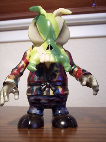
 Camo Bee
|
| Thu May 24, 2007 10:23 am |
 
|
|
|
BloodDrinker6969
Die-Cast
Joined: Sun Nov 26, 2006 9:13 pm
Posts: 12024
Location: Chicago, Like R.Kelly
|
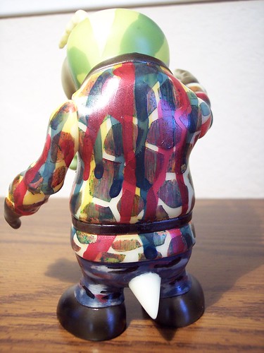
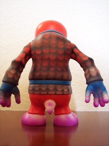
The head part is great, but the body seems a little busy. Still cool though.
_________________
Greedy Wants
Trades
|
| Thu May 24, 2007 10:26 am |
|
|
|
justinvancouver
Addicted
Joined: Mon Jan 15, 2007 5:14 pm
Posts: 583
Location: Vancouver,BC,Canada
|
Your Bee is great. It's nice to see some new styles..
_________________
Not looking for Zags and Cronic anymore....
|
| Thu May 24, 2007 10:32 am |
|
|
|
chris
Addicted
Joined: Sun Dec 04, 2005 1:38 pm
Posts: 597
Location: Tx
|
Strip it and start agiain. Seriously.
|
| Thu May 24, 2007 10:33 am |
|
|
|
rhinomilk
Vintage
Joined: Sun Apr 09, 2006 4:15 pm
Posts: 7136
Location: Bay Area
|
chris wrote: Strip it and start agiain. Seriously. yeah, i will probably do that... there's things that i like about it, but probably doesn't go well when i mash it all together, so trying to get some feedback.
|
| Thu May 24, 2007 10:37 am |
|
|
|
toybotstudios
Die-Cast
Joined: Sat Jul 01, 2006 11:40 pm
Posts: 8096
|
camo is cool.
my only suggestion is to re-do the body in camo colors, but maybe keep the pattern (sans the dripping blood)
I would love to see a camo Bee.
the head is cool. maybe a bit less linear pattern on the face.
i'm thinking Ahnold in "predator" look here...
_________________
www.toybotstudios.com
toybot studios Webstore!
|
| Thu May 24, 2007 10:41 am |
|
|
|
tavaro
S7 Royalty
Joined: Tue Jan 30, 2007 1:25 pm
Posts: 3165
Location: L.A.
|
I like the honeycomb pattern, maybe experiment more w/ that. 
|
| Thu May 24, 2007 10:48 am |
|
|
|
MANIMAL
Line of Credit
Joined: Thu Jun 08, 2006 3:06 pm
Posts: 1657
Location: Connecticut
|
the head is very well done - continue that look onto the body
_________________
...is it hoarding if you are buying doubles of stuff nobody else is after? - Pogue
|
| Thu May 24, 2007 12:30 pm |
|
|
|
Dean
Prototype
Joined: Sun Feb 18, 2007 9:53 pm
Posts: 6232
Location: 415
|
I agree that the bee would succeed better if the pattern on the head were extended to the rest of the body. I like that you kept the lining and belt of the gi black instead of making the whole thing patterned. Good thinking. One thing I like about the head is that you didn't try to cramp a whole bunch of camo elements onto it. Using big areas of color is really working here ... and it actually does look like camo. I also tend to agree that the blood drippings on the body are maybe one element too many. That would probably look better on a more simple or solid color scheme. Anyway, please don't take these constructive criticisms harshly. This is a really admirable effort and you've got some great ideas!
|
| Thu May 24, 2007 1:03 pm |
|
|
|
living dead
Prototype
Joined: Mon Feb 20, 2006 5:53 pm
Posts: 6349
Location: Yokosuka, Japan
|
I really like the Camo Head, but would have to agree about stripping the body. It looks like a smoker jacket gone really wrong. I do like the head though.
I like that you tried something new, but it's too solid and too busy at the same time on the jacket if I'm making any sense?
|
| Thu May 24, 2007 1:20 pm |
|
|
|
Arin C.
Line of Credit
Joined: Thu Oct 20, 2005 1:54 pm
Posts: 1530
Location: the vegas
|
The eyes and hands are cool too, but yeah, the jacket is pretty distracting
_________________
Wants | Haves | Show
|
| Thu May 24, 2007 1:27 pm |
|
|
|
rhinomilk
Vintage
Joined: Sun Apr 09, 2006 4:15 pm
Posts: 7136
Location: Bay Area
|
living dead wrote: I really like the Camo Head, but would have to agree about stripping the body. It looks like a smoker jacket gone really wrong. I do like the head though.
I like that you tried something new, but it's too solid and too busy at the same time on the jacket if I'm making any sense? no. nobody asked for your opinion
|
| Thu May 24, 2007 1:38 pm |
|
|
|
DYBBUKIM
Post Pimp
Joined: Sat Feb 18, 2006 2:49 pm
Posts: 2726
Location: San Frandisco
|
Jeff, that bee is fantastic. You tried to mix themes, and it works. It does look unusual in that few figures can do this and pull it off. Don't listen to those who don't like it -- great paints will always have those who hate them.
Thanks for sharing.
_________________
Hail HYDRA!!!
|
| Thu May 24, 2007 2:03 pm |
|
|
|
LamourSupreme
Mini Boss
Joined: Sat Mar 25, 2006 5:19 pm
Posts: 4010
Location: now
|
i dont know. am i the only one that likes that jacket? looks great to me.
i say it's a keeper.
|
| Thu May 24, 2007 3:16 pm |
|
|
|
siphilon
Addicted
Joined: Sun Mar 12, 2006 6:33 pm
Posts: 981
Location: a strangely isolated place
|
LamourSupreme wrote: i dont know. am i the only one that likes that jacket? looks great to me.
i say it's a keeper. yes I like the body, the head needs to be changed! 
but then again the painting on the head looks really good, especially from the profile view, I'd say go with that theme throughout.
|
| Thu May 24, 2007 4:23 pm |
 
|
|
|
SHAPESHIFTA
Comment King
Joined: Fri Oct 21, 2005 8:57 pm
Posts: 1142
Location: Seattle the Emerald City
|
I like the head and the jacket, however I think there is too much contrast between them. I think the pattern on the jacket is great, but I think it would have flowed better if you had used the same color combo as the head ,or vise versa.
SHAPE
_________________
Support INDEPENDANT ARTISTS !
www.hleeporter.com
http://www.flickr.com/photos/shapescustomart/
|
| Thu May 24, 2007 4:24 pm |
|
|
|
devilboy
Mini Boss
Joined: Tue Apr 04, 2006 6:44 pm
Posts: 4644
Location: HELL
|
xoconostle wrote: I agree that the bee would succeed better if the pattern on the head were extended to the rest of the body. I like that you kept the lining and belt of the gi black instead of making the whole thing patterned. Good thinking. One thing I like about the head is that you didn't try to cramp a whole bunch of camo elements onto it. Using big areas of color is really working here ... and it actually does look like camo. I also tend to agree that the blood drippings on the body are maybe one element too many. That would probably look better on a more simple or solid color scheme. Anyway, please don't take these constructive criticisms harshly. This is a really admirable effort and you've got some great ideas! i agree with this. the head looks great and should be continued.
|
| Thu May 24, 2007 5:00 pm |
|
|
|
lurker
S7 Royalty
Joined: Thu Dec 08, 2005 8:22 pm
Posts: 3696
Location: Pittsburgh, PA
|
"Yikes"
_________________
http://www.monsterworship.com
|
| Thu May 24, 2007 6:12 pm |
|
|
|
rhinomilk
Vintage
Joined: Sun Apr 09, 2006 4:15 pm
Posts: 7136
Location: Bay Area
|
thanks for the feedback. i will probably redo the whole bee simply because it is for another boardmember and I can't send them something i'm not satisfied with... but this thing took me so long to do i figured i might as well get something out of it (feedback). i'm actually pleased with the jacket because i think if it were on black vinyl (instead of glow) it would have looked pimp, but on this it looks ugly
|
| Thu May 24, 2007 6:42 pm |
|
|
|
Pogue
Die-Cast
Joined: Mon Oct 17, 2005 9:25 am
Posts: 8218
|
_________________
plastichunter wrote: I just ate my Milton! It was a delicious late night snack. 
|
| Thu May 24, 2007 6:42 pm |
|
|
|
khanate
Side Dealer
Joined: Wed Dec 20, 2006 10:19 pm
Posts: 2190
|
Pop that head off! It looks amazing, I wouldn't change it a bit...just alter the body...
Actually there are a lot of cool techniques in the body as well, if you used each technique on a different figure they would look great!
_________________
pickleloaf wrote: explaining to the hot girl in the office your skull headed figure with saggy pants isn't nearly as fun as explaining your tentacled pile of shit with smokestacks
|
| Thu May 24, 2007 6:45 pm |
|
|
|
Stone
Side Dealer
Joined: Sun Jan 14, 2007 6:18 pm
Posts: 2251
|
Mmmmm,I love tha head but tha body is just a bit busy for me...
_________________
They call me "BIG" Jim Slade!!
|
| Thu May 24, 2007 8:01 pm |
|
|
|
lurker
S7 Royalty
Joined: Thu Dec 08, 2005 8:22 pm
Posts: 3696
Location: Pittsburgh, PA
|
that is why i put the quotes cause i imagined you were going to say it!
_________________
http://www.monsterworship.com
|
| Fri May 25, 2007 11:53 am |
|
|
|
abelincolnjr
S7 Royalty
Joined: Sat Dec 02, 2006 6:46 pm
Posts: 3200
Location: Brooklyn, NY
|
I actually quite like the jacket, it reminds me of some crazy ass modern pop art steez (which is good). Overall i think its striking, keep doin that thing. Its nice to see some customs that break from the norm.
_________________
LamourSupreme wrote: he looks like hes got anus hands.
Want List:
http://www.skullbrain.org/bb/viewtopic.php?t=10395
Collection Pics:
http://www.skullbrain.org/bb/viewtopic.php?f=17&t=29761
Website:
http://www.girlsbike.com
|
| Fri May 25, 2007 7:30 pm |
|
|
|
rhinomilk
Vintage
Joined: Sun Apr 09, 2006 4:15 pm
Posts: 7136
Location: Bay Area
|
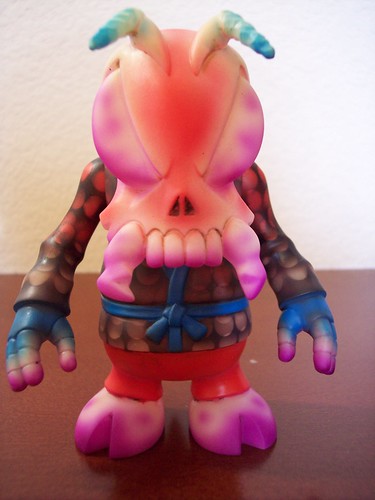
after 2 months this bee is revised (i'm slow). looks like a paul kaiju and lash custom had an ugly baby. peace.
|
| Mon Jul 16, 2007 7:50 pm |
|
|