
ANNOUNCEMENT:
There will be some planned downtime starting Wednesday, June 15th at 9am EDT. The board will be closed for approximately 12 to 24 hours while we work on migrating to a new forum software. For more information on the move, check out the Board Change Announcements thread.
|
|
|
|
It is currently Sat Dec 20, 2025 6:05 am
|
View unanswered posts | View active topics
 
|
Page 1 of 1
|
[ 8 posts ] |
|
| Author |
Message |
|
Rich
Die-Cast
Joined: Tue Mar 07, 2006 8:46 pm
Posts: 11806

|
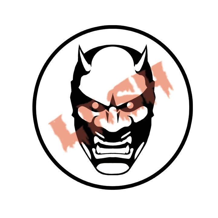
 New Logo ! Since I lost all my saved data including my logo I decided this was the perfect opportunity to refine it like I have been wanting.
Take a look and tell me what you think 
|
| Thu Oct 11, 2007 7:01 pm |
 
|
|
|
Dean
Prototype
Joined: Sun Feb 18, 2007 9:53 pm
Posts: 6232
Location: 415
|
The circle/mask makes a very strong mark. I love it. It's attractive, aggressive, and very "LASH." However as a friendly critique to my eye the typography distracts from the strength of the logo, and to be really anal about it, the letterform drippings are defying gravity on that slanted orientation, which is sort of unnerving. If the type element were moved off the mask, perhaps centered beneath the circle, I think it'd be even stronger as a logo. Also, perhaps red or another strong hue would work better than the pastel-ish flesh currently shown. I hope my critiques won't offend you because they're meant positively. Sorry to hear about the data loss! That royally sucks when it happens.
_________________
The People Kill The Earth, The Earth Kill The People!
|
| Thu Oct 11, 2007 7:08 pm |
|
|
|
Rich
Die-Cast
Joined: Tue Mar 07, 2006 8:46 pm
Posts: 11806
|
xoconostle wrote: The circle/mask makes a very strong mark. I love it. It's attractive, aggressive, and very "LASH." However as a friendly critique to my eye the typography distracts from the strength of the logo, and to be really anal about it, the letterform drippings are defying gravity on that slanted orientation, which is sort of unnerving. If the type element were moved off the mask, perhaps centered beneath the circle, I think it'd be even stronger as a logo. Also, perhaps red or another strong hue would work better than the pastel-ish flesh currently shown. I hope my critiques won't offend you because they're meant positively. Sorry to hear about the data loss! That royally sucks when it happens. lol ... the LASH is just there for thief reasons and WONT be there for anything else. Its NOT part of the logo
Like my stickers are.
Now I havec to get these made into stickers
|
| Thu Oct 11, 2007 7:11 pm |
|
|
|
lgcolddrink
Addicted
Joined: Tue Apr 17, 2007 11:32 am
Posts: 962
Location: Houston
|
I think it looks good but to be super anal, myabe bump it down 1 or 2 clicks within the circle. Otherwise looks excellent.
|
| Thu Oct 11, 2007 7:14 pm |
|
|
|
Rich
Die-Cast
Joined: Tue Mar 07, 2006 8:46 pm
Posts: 11806
|
Yeah I noticed that also. To fit it better.
|
| Thu Oct 11, 2007 7:16 pm |
|
|
|
lgcolddrink
Addicted
Joined: Tue Apr 17, 2007 11:32 am
Posts: 962
Location: Houston
|
Exactly. Have you tried a reversed version?
|
| Thu Oct 11, 2007 7:25 pm |
|
|
|
Rich
Die-Cast
Joined: Tue Mar 07, 2006 8:46 pm
Posts: 11806
|
lgcolddrink wrote: Exactly. Have you tried a reversed version? Yeah and its pretty cool
|
| Thu Oct 11, 2007 7:27 pm |
|
|
|
lgcolddrink
Addicted
Joined: Tue Apr 17, 2007 11:32 am
Posts: 962
Location: Houston
|
Awesome can't wait to see it. BTW the Obake you did is hands down best I've ever seen.
|
| Thu Oct 11, 2007 7:32 pm |
|
|
|
|
Page 1 of 1
|
[ 8 posts ] |
|
Who is online |
Users browsing this forum: No registered users and 4 guests |
|
You cannot post new topics in this forum
You cannot reply to topics in this forum
You cannot edit your posts in this forum
You cannot delete your posts in this forum
You cannot post attachments in this forum
|
|

